20080312

A few thoughts on Power Weapons.

Recently, Mannahnin, a moderator on DakkaDakka.com, posted photos of an army he's working on and asked for some thoughts on how to go about painting the power weapons in the army. It really started making me think about all of the different methods there are out there for painting these essential battlefield weapons. And just what kind of thought people really put into making a decision on a part of your model that can truly make or break your piece.

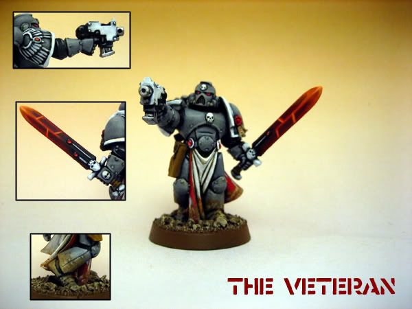
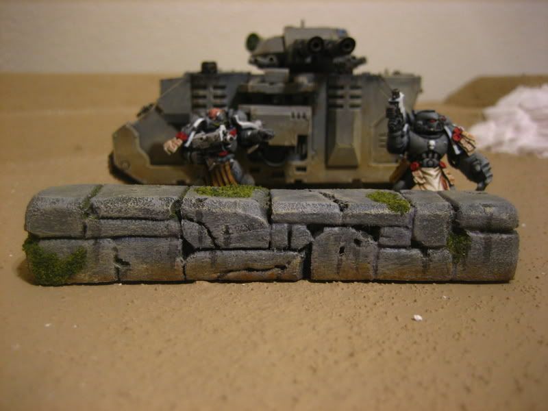
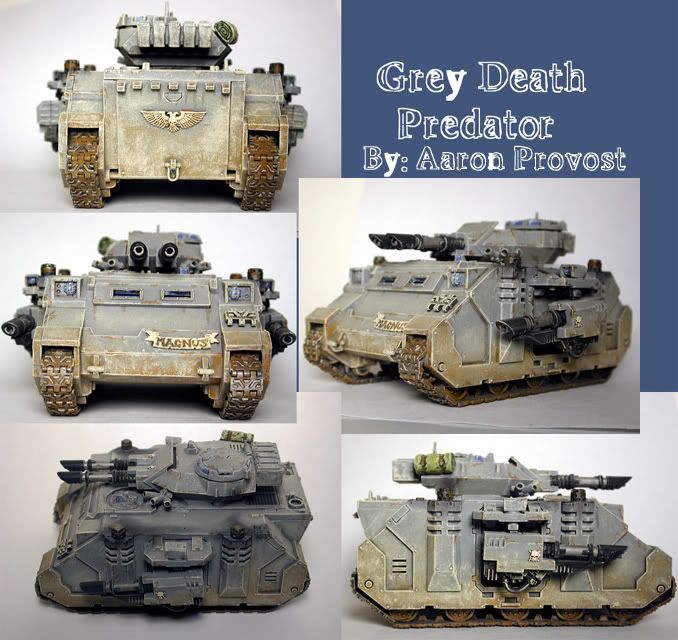
Recently, in the past few months, I had been working on painting new models for my Space Marine army, The Grey Death Legion. I started off simple, a few marines with basic weapons. Then I began a piece that I really wanted to put a lot of effort into. A Space Marine Veteran converted from an Emperors Champion model. I converted the model and got him to a state I was finally happy with and started to painting him. All was going as planned, with lots of care put into the detailing of the piece. Then I hit a wall. How was I going to paint that power sword? In the past, all I had ever done was paint them a dark metal color and be on my way. But this wasn't 6 years ago. I'd learned how to paint to a higher standard and wasn't about to ruin this great model.

So off to the internet I went in search of inspiration. Failing inspiration I was set to just copy a tutorial.

How did I want to paint my sword though?

Lightning effects are done to death, but with the right amount, it can give you a good effect that's pleasing and easy to paint. It's when people use it too much and it takes over the model as well as distract you from the detail that it starts to look garish and tacky. I found a rather nice and easy to follow tutorial in The Bolter & Chainsword's Modeling tutorial section. But it wasn't for me. I've seen it too much and am frankly sick of it.

Solid colors rarely look up to par, as most people don't put the time to properly shade the weapons, making the weapon look flat and toy like. Definitely not the look I was going for either. Although with the right amount of highlighting and depth, solid colors do look good. For an example of a solid colored power weapon that looks spot on, I redirect you to Lemmingspawn's Iron Warriors. Skip to page 7 to see what I am talking about.

I ended up going with a random tutorial I found over on CMoN. It was originally touted as a force weapon method. The tutorial in question is a sort of 'wave' effect. I gave it a go and my results were less than satisfactory.

Veteran 'Wave' Power Weapon

The issue's I had using the tutorial were that my surface wasn't flat like that in the tutorial, and the surface area just wasn't great enough to get the same effects. But it did open my eyes beyond what I had thought were the only ways out there to go about painting power weapons. And so I set out to find more inspiration to finally help finish my model.

I did lots of digging through websites and finally, after hours of searching, I found something I really wanted to give a try. This photo showed a way of painting them I hadn't seen prior. This was also a way I could really push my skill as a painter, as I knew that painting the weapon this way was going to take lots of glazes to get right. But in the end I was extremely happy with the choice I had made .

The Veteran

Some Additional Thoughts on Color
Another thing I see a lot of folks do is to pick a color completely outside of the palette they've used on a model to that point. And in a lot of these cases, it only hurts the piece as a whole. Take for example, my veteran above. As you can see, I was falling into this thinking trap of going for a color that doesn't really fit for the sake of making a weapon that stands out. When really I should have been looking to limit my palette to the colors I've already used on the piece. When you make a color decision about a major detail like a power weapon, take a step back and really look at the colors you've used to that point. Even if it's the smallest detailing (for example, the highlighting of my gems for my Veteran), you can still bring that color to the front and really incorporate more of it to help tie everything together.

20080306

Stone Walls Tutorial


After surfing some Black Gobbo back in the day, I noticed a nice little how-to and decided to give it a go. While the article is lost to the warp after the purge, it's spirit lives on in this tutorial.

Have to say, I'm rather impressed with the results for such a quick and easy project. I chose to use it on a small simple wall to try out some techniques I might end up using later on for terrain on my table.

I started off using just a small bit of pink insulation foam that I had laying about. I decided to start with a reliable old sharpie marker to get the lines down. Well, after finishing all the line work, I went to begin cutting into the foam and where there was sharpie, there was no longer nice solid foam, it ate away at the foam just enough so that when you cut directly into the line, you pulled up all the sharpie mark instead of making a neat little cut. So long story short don't use sharpie on foam projects!

After the sharpie failed me, I went back, cut out a new piece, and snagged a ball point pen. I lined everything out which ends up taking longer than one would expect to get the 'rocks' lining up properly!

Stone Wall

After lining I got to cutting in the lines. To start out I just cut a thin shallow line right on top of the drawn lines, then I took a pencil and pressed it into the cuts. This really doesn't work as easily as you expect it to. You've gotta really get in there with the pencil and go over the same spots multiple times. I ended up pulling the knife back into service in a lot of spots that were being stubborn. I weathered them a bit by trying to sand out some corners, but again, not the greatest of results from this. Sanding is awesome on most materials/projects. But for this one, it just seemed to texture the foam in a way I really wasn't too keen on. So I don't really suggest sanding all that much. I would just stick to the knife on this one. After trying to sand, I cut out some corners, and added some cracks and divots to complete the weathering.

Stone Wall

Remember, Spraypaint Melts Foam, so be sure you don't go nuts with the spray can. I used a bit of dark interior latex paint I had been using on my table project for a basecoat here. Marines in for scale of course. You can, of course, coat the entire project with a thin layer of White Glue should you really need to spray though.

Stone Wall


Then I set to painting. I went with a Codex Grey base with a Fortress Grey highlight around the edges and cracks, and very lightly drybrushed all over with Fortress as well. I added some weathering around the base of the model then with Bestial Brown, very lightly highlighted with Snakebite Leather. Using a very thinned out wash of Chaos Black, I added 'drainage' from cracks and divots. After it was all said and done, I did a quick drybrush over it all with Bleached Bone.

Stone Wall

When the paint was finished and dry, I pulled out the Woodland Scenics Blended Turf I've had sitting around for years. To add this simply paint on some White Glue and dip it into the flock. I found that it took two or three dips until I wasn't seeing wet glue spots.

Stone Wall

And it's done! Wait for the glue to finish drying and hit it with a quick Matt Varnish.

All in all, a really easy but effective method. It would definitely work wonders on a full building or ruins. I suggest you give it a go.

Here's another try with the same method. I ended up skipping the pencil step for this piece and just cut into the foam at angles to get the separation for each stone. I wanted to try and get multiple levels on this one, making it feel less like a big pillar and more like a defunct wall section. It's just as thick as the last piece, if not thicker, but it looks more natural than the last one. I'm happy with the results for the time invested.


Stone Wall Corner

Stone Wall Corner

Stone Wall Corner

This was merely a time killer, again not a finished or completed piece, but it does it's job as an easy quick piece of terrain that can really spice up a battlefield.

This technique and material has far ranging terrain and modeling possibilities, and it really a great way to build your terrain collection in a short amount of time. If you've done something similar, we would love to see it! And any tips you might have to share are always welcome as well!

20080304

Varied Skin Tones

Most folks just pick one single skin tone for an entire army. I personally have always found this completely off keel with what I've come to expect from a group as large as an army. Line up any squad in todays US Army and I'll show you different shades and colors all over the place.

So today I had my mind set to get the faces of my Imperial Guard Storm Trooper squad painted up. I knew this was going to take a while since I had my heart set on changing the skin tones for each individual trooper. All said and done, I think I did an alright job considering the sculpts and the colors I've got available right now (I'm in desperate need of a restock, some new Vallejo stuff would be nice...).

Here's a quick collage I put together to help showcase the variety you can get even with a limited palette of colors:


In the future I plan to go even deeper with different wash colors and the like. But for now, with this tabletop squad, this satisfies my need to try something different!

Tank Weathering


Here is an old tutorial from the old Painting Corps website. This is a very simple straight forward approach. I plan on updating this in the future with full blown photos of the technique in progress.

Step One - Though it's really not that short of a step...

First, take your tank, paint it as you normally would, don't forget anything, it should look like it just rolled off the assembly line.

Step Two - Scrape and cut and damage it

The simplest, and most effective way to do this is by taking Chaos Black and making a mark on the tank. Then take your Boltgun Metal, fill most of that black in leaving just a bit of black lining the silver. This will give you some depth to the cuts on 2-D surfaces. I picked this one up when Codex: Orks was released, and have used it since. I've also found that using a brown in place of black will give you an even dirtier look.

Step Three - Add some grime

Around all the hatch openings, the bottoms of damage and scrapes, and along creases where you might think water would end up running through, you want to just lightly paint some lines of Chestnut Ink, watered down about 50/50 of course, to represent rust and other such grit. This is a very real detail that is on EVERY tank I have had the pleasure to see and work with. Even the tanks that are part of outdoor museums. which are never used at all, have plenty of these streaks.

Step Four - Go Muddin'!

This is where things start getting real messy and easier on you. Just take an old drybrush, that has bristles pointing every way but straight, and start dabbing on some Bestial Brown. Work your way from the bottom up, getting lighter the higher you go. You'll probably want to stop around a third of the way up the tank. Do this for all sides, trying to keep it about level all around the tank.

Step Five - Go...Dry Muddin'?

Break out the good old Snakebite Leather now and do the exact same thing. Make sure to leave some of the Bestial Brown showing through though, this will give the mud some depth.

Step Six - Last but not least

Dust the entire tank now with Bleached Bone to represent dust falling all around the vehicle and settling down. This is to be applied across every surface. Every time I went to the field, unless it was raining and the ground wasn't wet, we have dust covering just about every facet of our Bradley's. And so should your miniature tanks! Don't go too overboard though on this, you still want to have the base color of your tank showing through, it's just to get a good dirty look. With this you also must remember one thing, dust to the rear of the vehicle will be MUCH worse than dust to the front. So come up the sides a bit more towards the back end, and for the rear of the tank, come up probably about three quarters of the way with a nice heavy dusting of bleached bone.


Conclusion - Yep it's over already

That's it. I know you can't get a good idea of the overall picture from the above swatches, but to see a finalized dirt job, check out my Space Marine Predator:
Weathered Space Marine Predator

20080303

A trip to Petco

Whenever I get around to going shopping by myself, I get time to really geek out. I get to check out all of the isles that normally the wife and I just pass by while my mind longingly thinks of all the great modeling possibilities that may lie down those curious rows of products.

One such moment happened today while on a routine run to pick up some dog food from the local Petco.

While wandering toward the dog food isles, I decided to make a quick detour by the aquarium section. They have always been sources of inspiration and a great source of basic terrain material for so many people around the web, and I just knew there were some gems hidden in the rough. And as luck would have it, I was right. Check out these great finds:

Petco Finds

Petco Finds

Petco Finds

Petco Finds

Petco Finds

Mind you, my wallet kept me from buying all these great pieces of inspiration, and to be honest, I'm not even certain how much any of them cost as they weren't over the correct price tags when I was taking the photos with my trusty camera-phone. But if you're interested in some of this stuff, I definitely suggest you check out the Petco Aquarium Decor section of their site. Or any Pet store with aquarium stuff for that matter. You might just get lucky and find something for your wargaming needs!

The Corps Have a New Home

Well after fussing with FTP program after program, I'm finally sick of trying to get my old web space back up and running. So, it was time for a new home! And I think this one will definitely suit my needs much better than creating my own site.

Here's to the future of The Painting Corps!